
You may have noticed across our social media that we have begun to roll out our rebrand! It's been a long while coming if I'm honest, finding the time to sit down and focus time specifically upon creating lots of concepts and ideas for our identity has been tricky. And tricky it has been because it needed our full attention rather than snippets of time here and there!
Anyway, to cut a long story short since we launched back in 2015 our simplistic hand-drawn logo and super simplistic colour palette of the acidic yellow, black, grey and white has worked for us. As we have evolved and grown as a business, specifically over the last year we have felt that our brand identity just didn't represent us fully any longer. There were elements of the original logo that we still loved and wanted to retain. The hand drawn approachable feel encourages warmth and the personable aspect that our brand is all about.
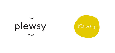
With this in mind, when Fiona started to sketch and note down initial ideas it became obvious that we needed to retain a hand drawn aspect within the new identity. That said, much feedback over the past few months had been about legibility of our logo and we had come up against challenges when designing new products - being able to place our logo to brand our new products well without it becoming lost within the design. So this pushed us in the direction of using a typeface for the brand name, rather than an updated version of hand lettering.
After analysing our journey, our customers, our brand values and our plans for the direction of our business, we experimented with various fonts and many many pages of sketchbook mark makings. After development and amendments, we decided on a simplistic hand drawn mark. This has become our brand symbol and frames the plewsy name.
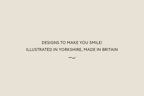
We have updated our strapline, retaining our illustrated in Yorkshire, made in Britain which has become recognised as a huge part of our brand over the last four years. We have found that the Yorkshire element really pulls people in when we are exhibiting at shows, especially outside of Yorkshire as many people resonate with our home county and it opens many avenues of conversation!
It's been tricky to put our finger on exactly what it is that we do, we have had paper goods/stationery/illustration in our description before, but we felt that as we push our product range a little further it needed to be a little broader. So here we are; Designs to make you smile! Illustrated in Yorkshire, made in Britain.
And finally, our brand colour palette. We feel most excited about this beautiful collection of colour! Inspired by the outdoors and designed to compliment our work our six new brand colours will be seen across our marketing materials from now on!

Hope you love it as much as we do!
Plewsy x